Company:
Elvie
Completed:
2022
My role:
Product Design
Usability Testing
Creative Briefing
Prototyping
Analytics
Elvie is a technology company creating a hub of connected health and lifestyle products for women. In 2014 they launched their first product, Elvie Trainer. It was the first product of its kind – an app-connected pelvic trainer to help women perform Kegel exercises correctly. Today, the competitive landscape looks very different. There are now multiple products on the market that have similar claims.
In 2021, I was tasked with improving the experience for Elvie Trainer users with a focus on software updates. I was the lead digital product designer in a cross-functional team covering service design, content design, research, product management, data science and software development.
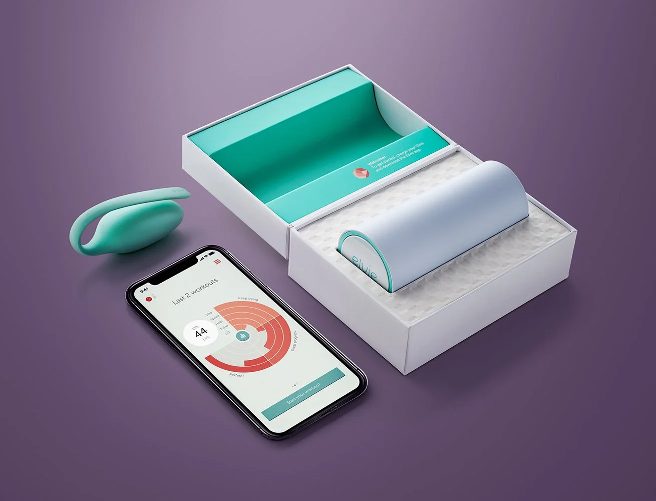
Elvie Trainer
The problem
Early research established that most users dropped off before completing the first level. This was due to:
Limited support for incorrect technique
Some women experience a very weak pelvic floor after childbirth / menopause, and were unable to progress beyond level requirements
Difficulty with habit-forming and adhering to practice (a universal pattern in physio)
Lack of variety in exercises and experience

Sankey diagram visualising drop off rates
We decided to kick off design discovery work around early use, to ensure users of all different abilities were able to engage with Elvie Trainer, and create a solid foundation for future features.
We ran discovery sprints, focusing on pelvic floor assessment journeys, a ‘gentler path’ for users with limited pelvic floor strength, improved support around correct technique and a better homepage experience.

Early design discovery work


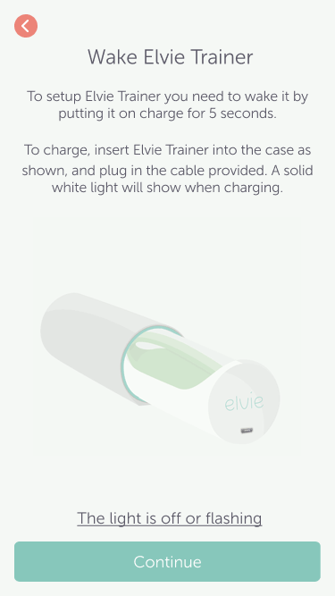
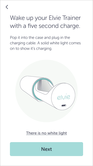
We then refined these concepts with a focus on the initial onboarding journey and improving accessibility.
Key design features
Moving from a goal-oriented approach to a task-oriented approach. The previous implementation overloaded users with too much information upfront – we redesigned the content on a step-by-step, need-to-know basis.
Setting expectations first. A connected product experience calls for physical tasks as well as digital. We made sure users had everything they needed ahead of time, for a more seamless set up.
Introducing help at the point of need. Rather than relying on users seeking out articles in the help centre, we added proactive troubleshooting features at key pain points in the journey.
Inclusive and empathetic support. The content was designed with a wide and varied range of users in mind. Key information was captured in larger headings, and checked for readability.


User testing
We ran comprehension testing sessions with eight participants, using a combination of low and high-fidelity prototypes. These sessions were designed to test the language/phrasing of our designs, and evaluate the ease of use in regards to logic pathways and UI.
We captured every bit of feedback and used affinity mapping to identify the high-priority changes to make ahead of design delivery.

Affinity mapping the feedback from user testing
Final style guidelines
I also led the development of a new illustrative style, collaborating closely with Brand. The style was defined across a selection of illustrations, and then applied throughout the onboarding flow.
I defined the following principles for the visuals:
Be representative and inclusive. The existing Trainer illustrations featured a very slim woman. This alienates many postpartum women, who are in a phase of life where weight gain is very normal.
Keep the focus on the action. Don’t make me think!
Strive for high contrast. This makes illustrations easier to view with low vision, in low-light conditions and on a quick glance.
Be accurate. Capturing the form of the product properly is key to reducing ambiguity and usability issues.

Style guide defined through iterative design process
Design delivery
We worked closely with developers to deliver the design in sprints, starting with accessibility updates and new create account/sign in flows. As we were a new team, we defined our own design documentation processes:
All logic pathways and acceptance criteria were captured with custom-built flowcharts.
Event tracking information was documented in custom Figma components, to provide one source of truth.
Responsive design rules were captured for each unique screen template.


Key outcomes
The designs performed well in comprehension testing, with participants scoring an average confidence rating of 4.4 out of 5 after completing the onboarding flow
Key parts of the digital experience (ie. buttons, navigation, create account/sign in) were redesigned to meet accessibility guidelines and improve journeys throughout the product
The new illustrative style has been reused by the business across other touchpoints and will form part of their strategic rebranding work


You can explore a full animated prototype of the new onboarding flow here.
