Agency:
AND Digital
Client:
Cancer Research UK
Completed:
2024
My role:
UX/UI Design
Prototyping
UX Research
Design Systems
Design Leadership
Cancer Research UK (CRUK) is the world's leading cancer research charity. They are a major funder of cancer research, investing in scientists, doctors, and nurses to advance the understanding and treatment of cancer.
Their website is a crucial touchpoint in many of their key user journeys - donating to the charity, finding event information and getting fundraising support. In 2023, I joined a program of work focused on transforming the existing website, working alongside UX designers, content strategists, software developers and other digital specialists.
The problem
There were two core problems this work looked to resolve:
The website was a glut of content and components. Much of the content was out of date and organised around internal teams rather than user journeys, resulting in a disjointed user experience. There was very little consistency across the frontend, due to the lack of a centralised component library.
The CMS was so old it was nearing obsoletion. The look and feel of the site was dated, and the existing tech stack was not set up to make significant changes at scale or pace.
CRUK wanted to migrate their content to a modern, headless CMS but also overhaul their content in the process to reduce redundancy and better serve their users. They also had recently undergone a rebrand, and wanted this reflected in their digital expression.

Original website page examples - inaccessible text in imagery, dated and inconsistent visual design
The approach
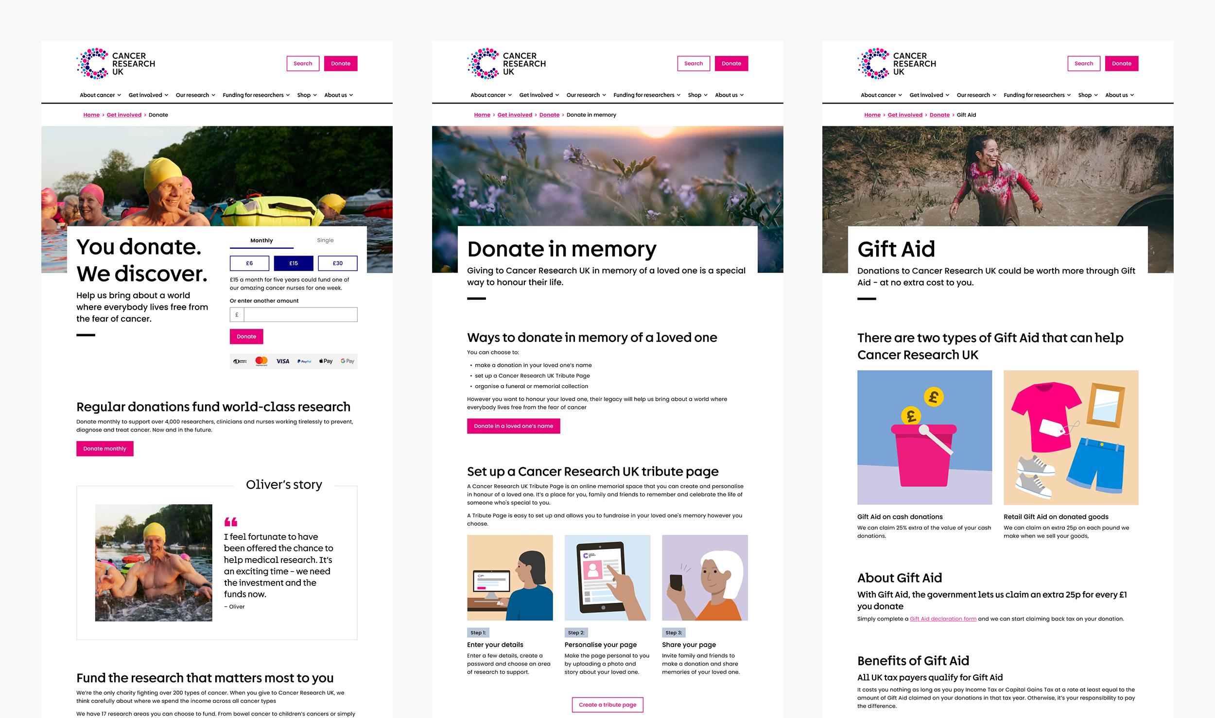
In order to deliver this ambitious piece of work, we worked on thin slices of functionality at a time. For each slice, we ran a discovery and delivery phase, and iterated on our approach as we moved through the slices. The first slice was chosen for its strategic importance to the charity – all pages under the /donate section of the site.
Discovery
To better understand the as-is content, the team conducted:
An audit of the frontend components in use - helping us scope the components required.
A heuristic evaluation - understanding usability issues prevalent in the as-is solution.
A content crit - evaluating whether the content fulfilled a genuine user need.
As-is user flow mapping - understanding the user flows currently supported by the design.
Quant/qual analysis - reviewing analytics & any previous feedback or research available.
Through these activities, we reduced the pages in scope from over a thousand (!) to 11, and drew up an prioritised list of components. This gave us a solid foundation on which to start ideating.


Design development
We had two primary goals in our design ideation phase:
Start translating the new brand guidelines into a digital design system
Create page designs to validate with end users
We adopted an iterative and collaborative process – creating component concepts in a ‘playground’ for group critique, and then stress-testing them with content provided by the content strategy team. Through this collaboration, we created an initial set of responsive components and page designs ready for testing.
A selection of page designs ready for testing
Testing
Before committing our designs to code, we wanted to validate our pages with end users. We conducted moderated user testing sessions on our Figma prototypes to understand:
If users were able to comprehend the content
If the content supported users to achieve their goals
What users thought of the overall look and feel of the pages
We then consolidated this feedback and iterated on the designs before moving them into production.

Analysing the notes from our first round of testing
We then ran a second round of user testing on the first deployment of the website, to understand how accessible it was to users with visual and cognitive impairments. Watching users interact with the actual website (rather than a static prototype) meant we could properly evaluate how the site interacted with various forms of assistive tech.
We found some critical issues in this round of testing, including an issue with the cookie banner that blocked users using a screenreader from entering the site. These issues were mitigated ahead of our first release.
Helix
As we moved through subsequent slices of functionality, we created a parallel stream of work to properly document the design system as it took shape. Helix, our digital design system, was composed of:
A Figma UI toolkit for prototyping
A Zeroheight documentation site to support design best practice
A Storybook site to support front-end developers using our components
We also defined governance and operating models for internal consideration and sign off.


Key learnings
After delivering the Donate slice, we went on to complete the process for other slices:
Health Professionals (content aimed at medical professionals to support their cancer practice)
Philanthropy (content aimed at those able to support the charity with gifts over £10,000)
These subsequent slices gave us our biggest learnings:
Not all slices are equal. The Health Professionals content was particularly dense and subject to specialised internal sign-off processes. This slowed and limited our content design efforts. It was also a relatively low-traffic section of the site, so our work had less immediate impact.
Vertical slices made us lose sight of the bigger picture. Not all components required to deliver the chosen slices were reusable across the rest of the organisation. We identified the need for a horizontal stream of work to ensure the design system would scale appropriately.


Key outcomes
A comprehensively documented, multi-brand design system ready for widespread use.
On average, a 50% increase in engagement rate across all slices delivered.
Funnel conversion uplifts – for example, an 11% increase from the Donate in Memory landing page – £72,628 additional income in Q4 23/24 alone.
A subsequent migration – the SU2C minisite - completed in just 12 weeks, thanks to the technology and design developed in the program.
